Your logo is often the first thing a potential customer notices about your business. It shows up on your website, your social profiles, your storefront, your invoices, and every piece of marketing you create. A good logo doesn't just look nice — it works hard, communicating who you are at a glance and holding up across every size and surface it's used on.
So what actually separates a strong logo from a weak one? Let's break down the traits that matter, the mistakes to avoid, and a checklist you can use to evaluate your own mark.
Simplicity
The most recognizable logos in the world are simple. A clean design is easier to remember, easier to reproduce, and easier to recognize at a glance — whether it's on a billboard or a tiny app icon. If you have to explain your logo before someone "gets it," it's probably too complicated.
Simplicity doesn't mean boring. It means stripping away anything that doesn't need to be there so the core idea comes through clearly.
Memorability
A good logo sticks in someone's mind after just a few glances. This usually comes from a distinctive shape, an unexpected use of negative space, or a clever pairing of icon and type. Memorability and simplicity go hand in hand — the fewer elements competing for attention, the more likely people are to remember the one that matters.
Relevance
Your logo should feel appropriate for your industry and audience without being a literal cliché. A law firm's logo will likely feel different from a bakery's, and that's a good thing. Relevance is about tone: is your brand playful, premium, rugged, or minimal? The logo should hint at that before a customer reads a single word.
Scalability
A logo needs to work everywhere — from a favicon the size of a fingernail to a banner on the side of a vehicle. If fine details disappear or the design turns into a blurry blob when shrunk down, it isn't scalable. Test any logo concept at multiple sizes before committing to it.
Readability
If your logo includes text, that text needs to be legible at a glance, in your brand colors, and in black and white. Overly decorative fonts might look interesting in a mockup but can become unreadable in real-world use, especially on smaller screens or low-quality print materials.
Color Choices
Color carries meaning and emotion, and it plays a big role in brand recognition. A few things to keep in mind:
- Choose colors that reflect your brand's personality and appeal to your target audience.
- Make sure your logo still works in a single color — you'll need a black or white version for certain uses.
- Check contrast so your logo remains legible on both light and dark backgrounds.
Typography
If your logo uses a wordmark or includes your business name, font choice matters as much as the icon. Typography should match your brand's tone — a rounded, friendly font sends a very different message than a sharp, geometric one. Avoid trendy fonts that may look dated in a few years, and always test how the type reads at small sizes.
Originality
A good logo should be distinct from competitors in your space. Take a look at other businesses in your industry before finalizing a design — you don't want your logo to be mistaken for someone else's. Originality also protects you down the road if you ever want to trademark your mark.
Logo Variations
A single static logo file isn't enough for modern branding. A complete logo package typically includes:
- Primary logo – the full version, used whenever space allows.
- Secondary/stacked version – a rearranged layout for square or vertical spaces.
- Icon or mark only – for social media profile pictures and favicons.
- One-color and reversed (white) versions – for dark backgrounds or single-color printing.
Having these variations ready saves time and prevents someone from stretching or altering your logo incorrectly down the line.
File Formats a Business Should Receive
Not all image files are created equal, and it's worth understanding what each one is for:
| Format | Best Used For |
|---|---|
| SVG | Scalable vector format ideal for websites — resizes without losing quality |
| PNG | Web and digital use with transparent backgrounds (social media, presentations) |
| JPG | Photos or backgrounds where transparency isn't needed; not ideal for logos with transparent areas |
| Sharing print-ready files with vendors, printers, or partners | |
| EPS | Editable vector file for professional printing (signage, apparel, packaging) |
If a designer only hands you a single JPG, you're likely to run into quality or transparency issues down the road. Ask for the full set, especially the vector files (SVG or EPS), since those can be resized infinitely without losing sharpness.
Common Logo Mistakes to Avoid
- Too much detail: Intricate designs fall apart at small sizes.
- Following trends too closely: A logo built around this year's design fad may look outdated quickly.
- Poor color contrast: Logos that only work on one background color are limiting.
- No vector file: Without one, resizing for large formats like signage becomes a problem.
- Copying competitors: Even unintentional similarity can confuse customers or create legal issues.
- Skipping variations: Relying on one layout forces awkward resizing later.
Logo Evaluation Checklist
Key takeaways:
- Is it simple enough to recognize in a fraction of a second?
- Does it still look good shrunk down to a small icon?
- Is any text legible at small sizes?
- Does it work in full color, one color, and reversed on a dark background?
- Does it feel distinct from competitors in your industry?
- Do you have all the file formats you need (SVG, PNG, JPG, PDF, EPS)?
- Do you have primary, stacked, and icon-only variations?
If you answered "no" to more than one or two of these, it may be time for a refresh rather than a full rebuild.
Working With a Designer
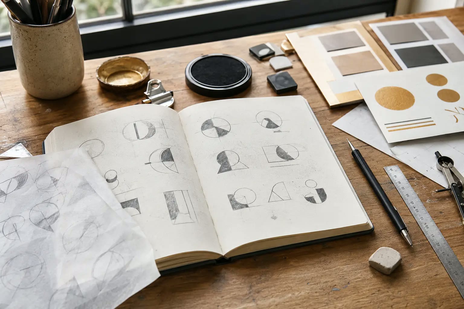
A good logo is the result of a clear process: understanding your audience, exploring concepts, gathering feedback, and refining the final design. If you're starting from scratch or evaluating whether your current logo is holding your brand back, browsing real examples in a portfolio can help you get a feel for different styles before you begin.
At Brand With Care, logo design is one piece of a broader set of branding and design services built to help small businesses across Central Texas show up consistently and professionally. If you're ready to talk through your logo or full brand identity, reach out for a consultation.
Conclusion
A good logo is simple, memorable, relevant, and built to scale across every use case your business needs — from a website favicon to a storefront sign. It's not about chasing trends or cramming in every idea you have; it's about distilling your brand down to something clean and recognizable that will still feel right years from now.
FAQs
How much should a small business logo cost?
Costs vary widely depending on the designer, the scope of the project, and how many variations and files are included. It's best to ask for a quote based on your specific needs.
Can I design my own logo with free tools?
You can, but free logo makers often produce generic designs that aren't original or don't include the full range of file formats and variations a growing business needs.
How often should a business update its logo?
There's no set timeline. Many businesses refresh their logo every several years to stay current, while others keep a strong, timeless mark for decades. Watch for signs like an outdated look, inconsistency across platforms, or a shift in your business direction.
What's the difference between a logo and a brand identity?
A logo is one visual asset. A brand identity includes the logo plus your color palette, typography, imagery style, and overall tone — everything that makes your business recognizable.
Do I really need a vector file if I'm not printing anything large right now?
Yes. Business needs change, and having a vector file ready means you won't have to pay to recreate your logo later when you need it for signage, apparel, or large-format printing.